Dagstuhl Seminar 23252
Inclusive Data Visualization
( Jun 18 – Jun 23, 2023 )
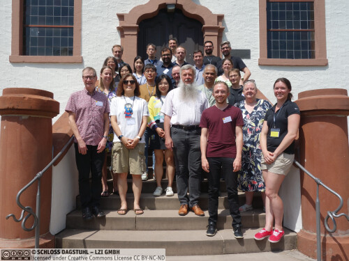
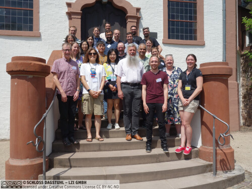
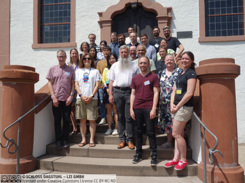
(Click in the middle of the image to enlarge)
Permalink
Please use the following short url to reference this page:
https://www.dagstuhl.de/23252
Organizers
- Bongshin Lee (Microsoft Research - Redmond, US)
- Kim Marriott (Monash University - Caulfield, AU)
- Danielle Szafir (University of North Carolina at Chapel Hill, US)
- Gerhard Weber (TU Dresden, DE)
Contact
- Andreas Dolzmann (for scientific matters)
- Susanne Bach-Bernhard (for administrative matters)
We live in a data-driven world, where copious data are generated and captured by computing devices and sensors on and around us, and critical decisions are made based on data. Experts and lay individuals alike have access to a large amount of data, and understanding data and sharing insights have become a core part of information work. Data visualization is a powerful means not only to analyze and explore data but also to identify and communicate data-driven insights. Most existing data visualizations, however, are designed on implicit assumptions about people's sensory, cognitive, and motor abilities. A lack of access to visualizations and their underlying data resulting from the differences in such abilities impacts people's education, work, lifestyle, and health, posing a significant equity issue. To address this important issue, visualization, accessibility, and other HCI researchers should work together to develop guidelines, methods, and techniques for increasing visualization accessibility.
One of the main goals of this Dagstuhl Seminar was to build partnerships and develop a shared understanding of this important research topic. This seminar helped us bring together researchers and practitioners from relevant fields, including data visualization, accessibility and assistive technologies, mobile and tangible interaction, human-computer interaction, health informatics, and vision science. It also provided opportunities to hear from representatives from disability support organizations and people with lived experience of disability. Furthermore, the unique setting of Schloss Dagstuhl helped us have an interactive dialog, facilitating the exchange of information and experiences, stimulating discussion and brainstorming, kickstarting collaborations, and identifying novel ideas around inclusive data visualization.
The main outcomes from the activities and discussions in this five-day seminar, which will be described below (The Week at a Glance), are:
- The establishment of a community around inclusive data visualization.
- The identification of open problems and challenges required to establish a rigorous foundation for inclusive data visualization.
- The development of an initial research agenda and plans for future activities in inclusive data visualization.
- The collaborations across different disciplines, including increased awareness of accessibility in the data visualization community and expanded awareness of data visualization in the accessibility community.
These outcomes will provide the impetus for a critical overarching goal: making data and visualization accessible to a broad range of people.
The Week at a glance
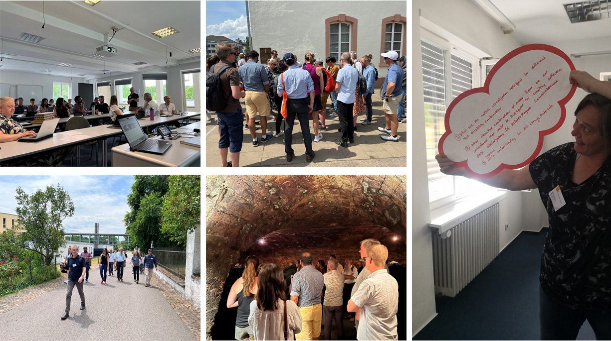
Figure 1 Some of the activities our seminar participants engaged: Self-introduction and taking a walk on Monday (left); Excursion to Trier and a Winery on Wednesday (center); and Grand challenge discussion on Friday (right).
Monday. The seminar started with a brief introduction by the organizers about the main goals, topics, and structure of the seminar. This introduction was followed by the first invited talk, which was scheduled before participants' self-introduction to accommodate the timezone of Louisa Willoughby, a remote speaker from Monash University in Australia. The organizers planned the total of five invited talks on Monday to help seminar participants understand the main challenges people with different disabilities (e.g., cognitive, motor, and vision impairments) face. Afterwards, participants introduced themselves describing their main interests and expertise along with their aims for the seminar, with a short single-slide presentation (Figure 1 top left), and then had the morning coffee break. The morning session ended with two invited talks: one by Kirsten Ellis from Monash University and the other by Eun Kyoung Choe from University of Maryland at College Park.
After having lunch and a group of participants taking a walk outside (Figure 1 bottom left), the afternoon started with a brainstorming activity, where we - all participants - discussed seminar goals and outcomes we wanted to achieve together. This was followed by the fourth invited talk by JooYoung Seo from University of Illinois at Ulbana-Champaign. After having the afternoon coffee break, we continued the brainstorming activity for 30 minutes. Then, the last invited talk was given by Shea Tanis, a remote speaker from University of Kansas in the United States. Finally, the first day ended with three invited demos (Figure 3 in the full report): one by Ather Sharif, a remote presenter from University of Washington in the United States, the second by Arvind Satyanarayan from MIT, and the third by John Thompson from Microsoft Research at Redmond.
Tuesday. The organizers called for volunteers who would like to share interesting work, including research outcomes (artifacts, systems, study findings, etc.) and viewpoints, relevant to inclusive data visualization through short lightening demos and talks. The Tuesday morning session started with four demos and talks:
- Haptification of Maps and Data by Gerhard Weber and Meinhardt Branig
- Audio-tactile Access to Floor Plans by Karin Müller
- Tactile Graphic Formats through Time and Their Varied Affordances for Inclusive Data Visualisation by Leona Holloway
- Designing Accessible Visualizations for People with Intellectual and Developmental Disabilities (IDD) by Keke Wu
Before having the morning coffee break, we finalized the brainstorming activity on the seminar goals and outcomes, and then initiated the process of identifying topics for breakout groups. After the coffee break, we discussed and decided breakout groups along with the logistics and plans for working group activities. We initially identified eight topics, but considering participants' availability, schedule, and relation between topics, we later merged two of them into others, resulting in six topics. The rest of the day was devoted to breakout group discussions on the first three topics: user needs and abilities, authoring and tools, and technologies and information displays.
Wednesday. Wednesday morning was mainly devoted to discussion in breakout groups to enable participants to further delve into their discussion topics, which was followed by the report back from each of the three groups. Right before lunch, Jason Dykes shared thought-provoking viewpoints to consider visualization as Visual Data Design: with this lens, other materials, modes, and approach can be considered as various Data Designs, such as Textual, Haptic, Audio, and Edible Data Design.
Following the Dagstuhl Seminar tradition, Wednesday afternoon was set aside for social activities. After having a guided group tour in Trier (Figure 1 center top), we visited the "von Nell" Winery to have a winery tour (Figure 1 center bottom) followed by wine tasting and dinner. This social event facilitated personal conversations and fostered the discussion on research collaboration opportunities and deeper networking in a more relaxed setting.
Thursday. The Thursday morning session started with the following six lightning demos and talks:
- Accessibility in the Context of India by Anirudha Joshi
- Action Audio by Cagatay Goncu
- Soundception: Multimodal Access to Depth in Images for Blind People by Helen Petrie
- 3D Printing to Support Access to Graphical Content by People Who are Blind or Have Low Vision by Matthew Butler
- Physicalization Platforms as Possible Media for Accessible Data Representation by Danielle Szafir
- Making for All: Including People Living with Disabilities by Kirsten Ellis
For the remainder of the day, we devoted the time for breakout group discussions, for the remaining three topics: data representations, education and literacy, and research methods. The day ended with the report back from each of the three groups.
Friday. Friday started with one lightning talk, Machine-learning based Dysgraphia Detection in Children Handwritings by Simone Marinai. Next, for the most of the morning, we worked as a group with an aim to identify the 10 grand challenges for inclusive data visualization. Then before lunch we briefly discussed next steps and how to build the community. This includes developing a website containing resources for inclusive data visualization and holding workshops and panels at relevant conferences. The day ended at lunch as participants left to make their way back home.
 Creative Commons BY 4.0
 Bongshin Lee, Kim Marriott, Danielle Szafir, and Gerhard Weber
We live in a data-driven world, where critical decisions are made based on data. Both experts and laypeople have access to large amounts of data and understanding data has become a core part of information work. Data visualization is a powerful means not only to analyze and explore data but also to identify and communicate insights. Most existing data visualizations, however, are designed on implicit assumptions about people's sensory, cognitive, and motor abilities. A lack of access to data visualization and the underlying data due to the differences in these abilities impacts educational and work opportunities, as well as health and lifestyle, posing a significant equity issue.
To successfully address this important issue, visualization, accessibility, and other HCI researchers should work together to develop guidelines, methods, and techniques for increasing visualization accessibility. To build partnerships and develop a shared understanding of this important research topic, this Dagstuhl Seminar aims to bring together researchers and practitioners from relevant fields, including data visualization, accessibility and assistive technologies, mobile and tangible interaction, human-computer interaction, and vision science, as well as representatives from disability support organizations and people with lived experience of disability. The main goals of this seminar are to:
- Increase awareness of accessibility in the data visualization community and awareness of data visualization in the accessibility community.
- Identify open problems and challenges that establish a rigorous foundation for inclusive data visualization.
- Develop a research agenda and plans for future activities in inclusive data visualization.
- Establish a community around inclusive data visualization and create collaboration opportunities.
Leveraging the unique setting of Schloss Dagstuhl, the focus of this seminar will be an interactive dialog between seminar participants with multidisciplinary backgrounds. This seminar will be structured to facilitate the exchange of information and experiences, to stimulate discussion and brainstorming, to kickstart collaborations, and to identify novel aspects and ideas around inclusive data visualization. The outcomes of the seminar generated from the activities and discussions will provide the impetus for a critical overarching goal: making the data and visualization accessible to a broad range of people.
Bongshin Lee, Kim Marriott, Danielle Szafir, and Gerhard Weber
On-site
- Catie Baker (Creighton University, US)
- Meinhardt Branig (TU Dresden, DE)
- Matthew Butler (Monash University - Clayton, AU)
- Eun Kyoung Choe (University of Maryland - College Park, US) [dblp]
- Soyoung Choi (University of Illinois - Urbana Champaign, US)
- Jason Dykes (City - University of London, GB) [dblp]
- Kirsten Ellis (Monash University - Clayton, AU)
- Christian Frisson (CA)
- Cagatay Goncu (Tennis Australia - Melbourne, AU)
- Leona Holloway (Monash University - Clayton, AU)
- Anirudha Joshi (Indian Institute of Technology Bombay, IN) [dblp]
- Bongshin Lee (Microsoft Research - Redmond, US) [dblp]
- Simone Marinai (University of Firenze, IT)
- Kim Marriott (Monash University - Caulfield, AU) [dblp]
- Karin Müller (KIT - Karlsruher Institut für Technologie, DE)
- Helen Petrie (University of York, GB) [dblp]
- Arvind Satyanarayan (MIT - Cambridge, US) [dblp]
- JooYoung Seo (University of Illinois at Urbana Champaign, US)
- Danielle Szafir (University of North Carolina at Chapel Hill, US) [dblp]
- John R. Thompson (Microsoft Corporation - Redmond, US)
- Tetsuya Watanabe (University of Niigata, JP)
- Gerhard Weber (TU Dresden, DE)
- Benjamin Weyers (Universität Trier, DE) [dblp]
- Stephanie Wilson (City - University of London, GB)
- Keke Wu (University of North Carolina at Chapel Hill, US)
Remote:
- Ather Sharif (University of Washington - Seattle, US)
- Shea Tanis (The University of Kansas - Lawrence, US)
- Louisa Willoughby (Monash University - Clayton, AU)
Classification
- Artificial Intelligence
- Graphics
- Human-Computer Interaction
Keywords
- Accessibility
- Data Visualization
- Human-Computer Interaction
- Human-Data Interaction