Dagstuhl-Seminar 12261
Putting Data on the Map
( 24. Jun – 29. Jun, 2012 )
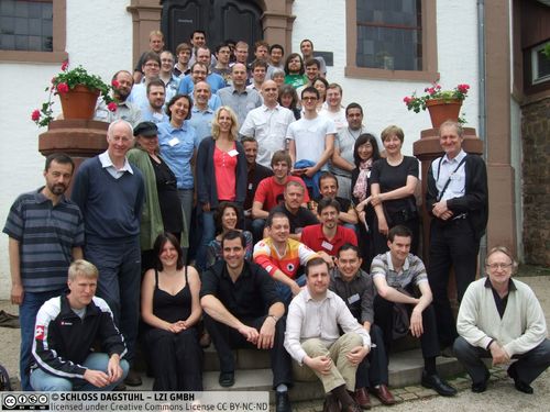
(zum Vergrößern in der Bildmitte klicken)
Permalink
Bitte benutzen Sie folgende Kurz-Url zum Verlinken dieser Seite:
https://www.dagstuhl.de/12261
Organisatoren
- Stephen Kobourov (University of Arizona - Tucson, US)
- Frank van Ham (IBM Netherlands - Amsterdam, NL)
- Alexander Wolff (Universität Würzburg, DE)
Kontakt
- Andreas Dolzmann (für wissenschaftliche Fragen)
- Simone Schilke (für administrative Fragen)
Impacts
- Semantic Word Cloud Representations : Hardness and Approximation Algorithms : article in LNCS 8392 LATIN 2014 : pp. 514-525 - Barth, Lukas; Fabrikant, Sara Irina; Kobourov, Stephen G.; Squarcella, Claudio; Pupyrev, Sergey; Okamoto, Yoshio; Nöllenburg, Martin; Lubiw, Anna; Ueckerdt, Torsten; Wolff, Alexander - Berlin : Springer, 2014 - (Lecture notes in computer science : 8392 ; article).
- Table Cartograms : article in LNCS 8125 : Algorithms - ESA 2013 - Evans, William; Felsner, Stefan; Kaufmann, Michael; Kobourov, Stephen G.; Mondal, Debajyoti; Nishat, Rahnuma Islam; Verbeek, Kevin - Berlin : Springer, 2013. - pp. 421-432 - (Lecture notes in computer science ; 8125 : article).
- Visual Encoding of Dissimilarity Data via Topology-Preserving Map Deformation : article : pp. 2200-2213 - Bouts, Quirijn W.; Dwyer, Tim; Dyke, John Van; Speckmann, Bettina; Goodwin, Scott D.; Riche, Nathalie Henry; Carpendale, Sheelagh; Liebman, Ariel - Los Alamitos : IEEE - (IEEE transactions on visualization and computer graphics : 22. 2016, 9).
Programm
Visualization allows us to perceive relationships in large sets of interconnected data. While statistical techniques may determine correlations among the data, visualization helps us frame what questions to ask about the data. The design and implementation of algorithms for modeling, visualizing and interacting with large relational data is an active research area in data mining, information visualization, human-computer interaction, and graph drawing.
Map representations provide a way to visualize relational data with the help of conceptual maps as a data representation metaphor. In a narrow sense, a map representation of a graph is a contact graph representation where the adjacency of vertices is expressed by regions that share borders. Such representations are, however, limited to planar graphs by definition. We can extend the notion of a map representation to non-planar graphs by generalizing the idea as follows: clusters of well-connected vertices form countries, and countries share borders when neighboring clusters are tightly interconnected.
Information spatialization and cartograms also connect the notions of data with those of maps. Cartograms redraw an existing geographic map such that the country areas are proportional to some metric (e.g., population), an idea that dates back to a paper by Raisz in 1934 and is still popular today. Spatialization is the process of assigning two- or three-dimensional coordinates to abstract data points, ideally such that the spatial mapping has much of the characteristics of the original high-dimensional space. Multi-dimensional scaling or principal component analysis are techniques that allow us to spatialize high-dimensional data. Techniques like information landscapes can then be used to convert the resulting two-dimensional coordinates into meaningful three-dimensional landscapes.
Providing efficient and effective data visualization is a difficult challenge in many real-world software systems. One challenge lies in developing algorithmically efficient methods to visualize large and complex data sets. Another challenge is to develop effective visualizations that make the underlying patterns and trends easy to see. And finally, we need to allow users to interactively access, analyze, and filter these patterns in an intuitive manner. All of these tasks are becoming increasingly more difficult due to the growth of the data sets arising in modern applications, as well as due to their highly dynamic nature.
- Muhammad Jawaherul Alam (University of Arizona - Tucson, US) [dblp]
- Daniel Archambault (University College Dublin, IE) [dblp]
- David Auber (University of Bordeaux, FR) [dblp]
- Peter Bak (IBM - Haifa, IL)
- Therese Biedl (University of Waterloo, CA) [dblp]
- Robert P. Biuk-Aghai (University of Macau, MO)
- Sergio Cabello (University of Ljubljana, SI) [dblp]
- Sheelagh Carpendale (University of Calgary, CA) [dblp]
- Walter Didimo (University of Perugia, IT) [dblp]
- Stephan Diehl (Universität Trier, DE) [dblp]
- Pierre Dragicevic (University of Paris South XI, FR) [dblp]
- Tim Dwyer (Microsoft Corporation - Redmond, US) [dblp]
- Jason Dykes (City University - London, GB) [dblp]
- Sara Irina Fabrikant (Universität Zürich, CH) [dblp]
- Stefan Felsner (TU Berlin, DE) [dblp]
- Martin Fink (Universität Würzburg, DE) [dblp]
- Joe Fowler (University of Arizona - Tucson, US)
- Fabrizio Frati (University of Rome III, IT) [dblp]
- Martin Gronemann (Universität Köln, DE) [dblp]
- Jan-Henrik Haunert (Universität Würzburg, DE) [dblp]
- Herman J. Haverkort (TU Eindhoven, NL) [dblp]
- Nathalie Henry Riche (Microsoft Corporation - Redmond, US) [dblp]
- Seok-Hee Hong (The University of Sydney, AU) [dblp]
- Ferran Hurtado (UPC - Barcelona, ES)
- Christophe Hurter (ENAC - Toulouse, FR) [dblp]
- Bernhard Jenny (Oregon State University - Corvallis, US) [dblp]
- Michael Kaufmann (Universität Tübingen, DE) [dblp]
- Philipp Kindermann (Universität Würzburg, DE) [dblp]
- Stephen Kobourov (University of Arizona - Tucson, US) [dblp]
- Jan Kratochvil (Charles University - Prague, CZ) [dblp]
- Giuseppe Liotta (University of Perugia, IT) [dblp]
- Anna Lubiw (University of Waterloo, CA) [dblp]
- William A. Mackaness (University of Edinburgh, GB)
- Petra Mutzel (TU Dortmund, DE) [dblp]
- Quan Nguyen (The University of Sydney, AU) [dblp]
- Arlind Nocaj (Universität Konstanz, DE) [dblp]
- Martin Nöllenburg (KIT - Karlsruher Institut für Technologie, DE) [dblp]
- Yoshio Okamoto (The University of Electro-Communications - Tokyo, JP) [dblp]
- Sergey Pupyrev (Ural Federal Univ. - Ekaterinburg, RU) [dblp]
- Andreas Reimer (Universität Heidelberg, DE) [dblp]
- Maxwell J. Roberts (University of Essex, GB) [dblp]
- Ignaz Rutter (KIT - Karlsruher Institut für Technologie, DE) [dblp]
- Falko Schmid (Universität Bremen, DE) [dblp]
- Monika Sester (Leibniz Universität Hannover, DE) [dblp]
- Bettina Speckmann (TU Eindhoven, NL) [dblp]
- Claudio Squarcella (University of Rome III, IT)
- Alexandru C. Telea (University of Groningen, NL) [dblp]
- Barbara Tversky (Stanford University, US) [dblp]
- Torsten Ueckerdt (Charles University - Prague, CZ) [dblp]
- Pavel Valtr (Charles University - Prague, CZ) [dblp]
- Frank van Ham (IBM Netherlands - Amsterdam, NL) [dblp]
- Marc van Kreveld (Utrecht University, NL) [dblp]
- Kevin Verbeek (TU Eindhoven, NL) [dblp]
- Dorothea Wagner (KIT - Karlsruher Institut für Technologie, DE) [dblp]
- Alexander Wolff (Universität Würzburg, DE) [dblp]
- Jing Yang (University of North Carolina - Charlotte, US) [dblp]
Klassifikation
- Data structures / algorithms / complexity
- Networks
- Computer graphics / computer vision
- Interdisciplinary
Schlagworte
- information visualization
- geovisualization
- geographic information systems
- cartography
- human-computer interaction
- graph drawing
- cartographic generalization
- schematic maps
- graph theory
- computational geometry