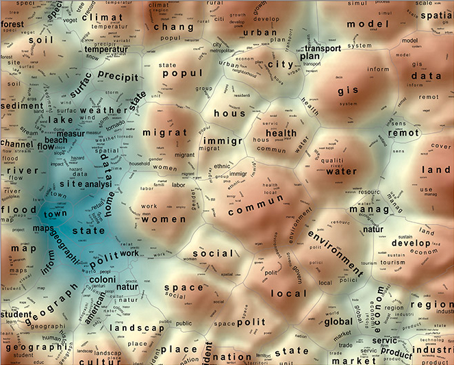
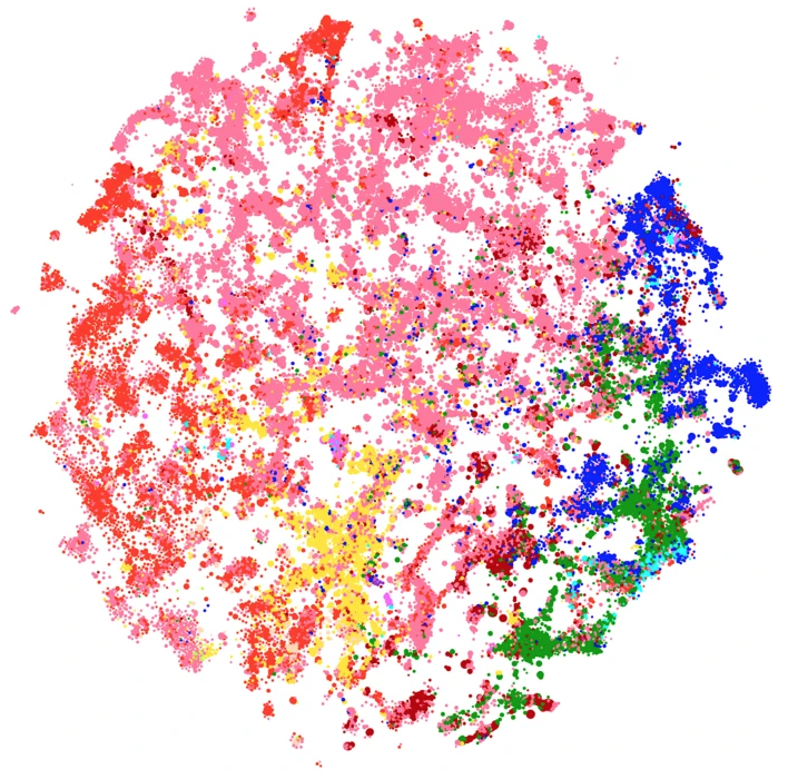
I.9 In Terms of Geography
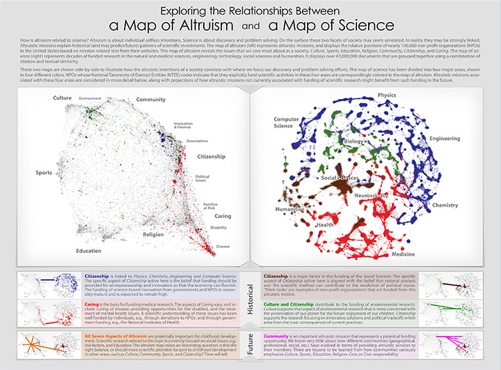
X.9 Exploring the Relationships between a Map of Altruism and a Map of Science
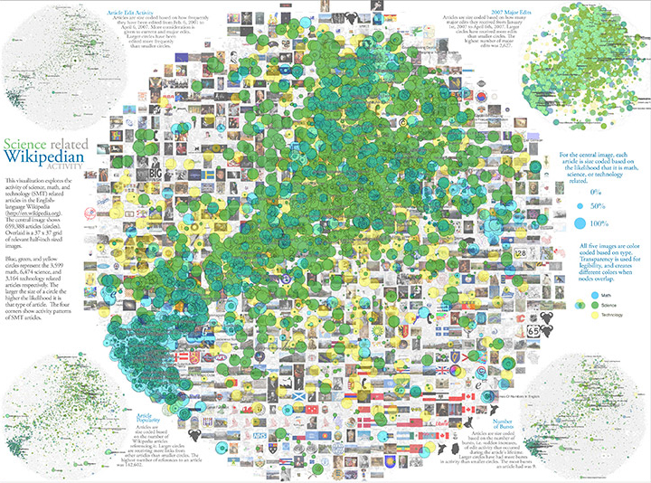
III.8 Science-Related Wikipedian Activity
SciTech Model of the PubMed Literature
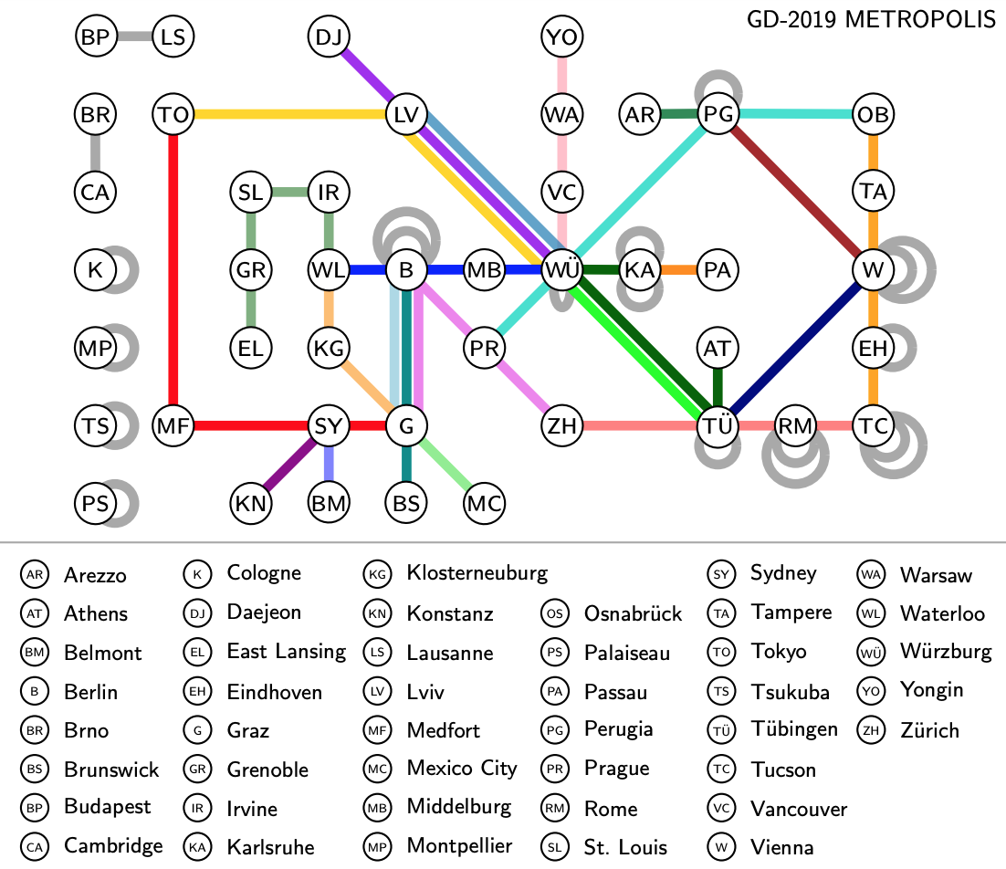
GD 2019 Metropolis
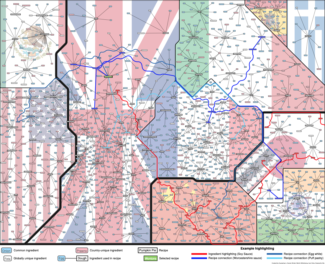
World Map of Recipes
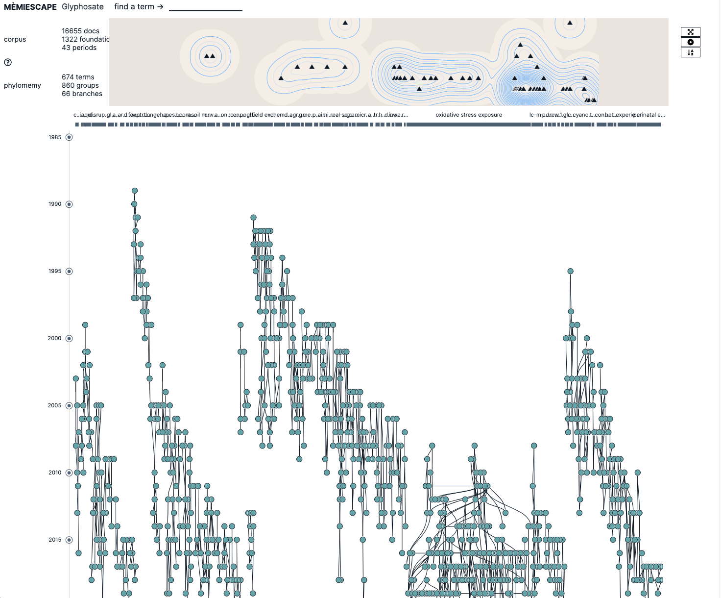
40 Years of Glyphosate Research

<i>Click the image above to view Map.</i> <br><br>André Skupin’s research interests focus on geographic visualization, cartographic generalization, data mining, and information visualization. This map was computed from more than 22,000 abstracts submitted to the annual meetings of the Association of American Geographers during a ten-year period from 1993 to 2002. The methodology is centered around the representation of each document as an n-dimensional vector of terms. These vectors are used to construct a neural network model of the geographic knowledge domain using a Self-Organizing Map (SOM). The neural network model is then transformed into two types of information: (1) a landscape in which elevation indicates the degree to which a single, focused topic is addressed; and (2) multilevel text labels associated with regions in the visualization. The final rendering was executed in standard geographic information systems (GIS) software.<br>
          <br><br> <b>Authors</b>: André Skupin
          <br> <b>References</b><ul>
          <li>Skupin, André. 2004. “The World of Geography: Visualizing a Knowledge Domain with Cartographic Means.” <i>PNAS</i> 101 (Suppl. 1): 5274-5278.

          <br><li>Skupin, André. 2005. <i>In Terms of Geography</i>. Courtesy of André Skupin, San Diego State University, San Diego, CA. In “1st Iteration (2005): The Power of Maps,” <i>Places & Spaces: Mapping Science</i>, edited by Katy Börner and Deborah MacPherson. <a href='http://scimaps.org'>http://scimaps.org</a>.</ul>
<i>Click the image above to view Map.</i> <br><br>Richard Klavans and Kevin W. Boyack are known for groundbreaking maps of science that serve as platforms for planning and evaluation. This work, their eighth contribution to the exhibit, shows several relationships between the worlds of altruism and science using maps of the two spaces. The map of altruism was created using text from the websites of 125,000 non-profit organizations (NPOs) in the U.S. using domain names provided by GuideStar USA, Inc. MALLET topic modeling was run on nearly 4 million web pages, and the mission-related topics were located in a two-dimensional space. The map shows the locations of nearly 100,000 NPOs overlaid on this topic space. A map of science was created from 43 million Scopus documents using a two-step process: documents were grouped into 156,000 clusters using a direct citation methodology, and the clusters were mapped using textual similarity. Together, the results demonstrate that, while most NPO efforts support day-to-day activities related to altruistic missions, a surprising amount is used to fund scientific research, particularly in topics related to innovation, environment, and medicine. In contrast, very little NPO effort is used to support research in altruistic missions dealing with different aspects of childhood development. Funding of more research to increase our understanding of these areas could lead to revolutionary advances that parallel those made in technology and medicine in recent years.
          <br><br> <b>Authors</b>: Richard Klavans, Kevin W. Boyack
          <br> <b>References</b><ul>
          <li>Klavans, Richard and Kevin W. Boyack. 2014. <i>Exploring the Relationships between a Map of Altruism and a Map of Science</i>. Courtesy of SciTech Strategies, Inc. In “10th Iteration (2014): The Future of Science Mapping,” <i>Places & Spaces: Mapping Science</i>, edited by Katy Börner and Samuel Mills. <a href='http://scimaps.org'>http://scimaps.org</a>.</ul>
<i>Click the image above to view Map.</i> <br><br>Developed by research programmers Bruce W. Herr II and Todd M. Holloway, graphic designer Elisha F. Hardy, and information scientists Kevin W. Boyack and Katy Börner, this map shows the structure and dynamics of the English Wikipedia based on 659,388 articles and their editing activity. The similarity of each article-article pair was calculated as the number of shared links to other articles. The resulting similarity matrix was read into VxOrd to generate the base map layout. An invisible 37 x 37 half-inch grid was drawn underneath the network and filled with relevant images from key articles. Overlaid are 3,599 math, 6,474 science, and 3,164 technology articles. They are color-coded in blue, green, and yellow, respectively, with all other articles appearing in grey. Exactly 8,181 articles are in one category, 2,348 in two, and 73 in all three categories. The four corners show smaller versions of the map with articles size-coded according to article edit activity (top left), number of major edits from January 1st, 2007, to April 6th, 2007 (top right), number of bursts in edit activity (bottom right), and the number of times other articles link to an article (bottom left). These visualizations serve to highlight current trends and predict future editing activity and growth in Wikipedia articles related to science, technology, and mathematics.
          <br><br> <b>Authors</b>: Bruce W. Herr II, Todd M. Holloway, Elisha F. Hardy, Kevin W. Boyack, and Katy Börner
          <br> <b>References</b><ul>
          <li>Holloway, Todd, Miran Božičević, and Katy Börner. 2007. “Analyzing and Visualizing the Semantic Converage of Wikipedia and Its Authors.” <i>Complexity</i> 12 (3): 30-40.

          <br><li>Herr II, Bruce W., Todd Holloway, Elisha F. Hardy, Kevin W. Boyack, and Katy Börner. 2007. <i>Science-Related Wikipedian Activity</i>. Courtesy of Indiana University. In “3rd Iteration (2007): The Power of Forecasts,” <i>Places & Spaces: Mapping Science</i>, edited by Katy Börner and Julie M. Davis. <a href='http://scimaps.org'>http://scimaps.org</a>.</ul>
<i>Click the image above to view Map.</i> <br><br>Portfolio analysis is a fundamental practice of organizational leadership and is a necessary precursor of strategic planning. Successful application requires a highly detailed model of research options. We have constructed a model, the first of its kind, that accurately characterizes these options for the biomedical literature. The model comprises over 18 million PubMed documents from 1996–2019. Document relatedness was measured using a hybrid citation analysis + text similarity approach. The resulting 606.6 million document-to-document links were used to create 28,743 document clusters and an associated visual map. Clusters are characterized using metadata (e.g., phrases, MeSH) and over 20 indicators (e.g., funding, patent activity). The map and cluster-level data are embedded in Tableau to provide an interactive model enabling in-depth exploration of a research portfolio. Two example usage cases are provided, one to identify specific research opportunities related to coronavirus, and the second to identify research strengths of a large cohort of African American and Native American researchers at the University of Michigan Medical School.
          <br><br> <b>Authors</b>: Kevin W. Boyack, Caleb Smith, and Richard Klavans
          <br><b>References</b><ul>
          <li>Boyack, Kevin W., Caleb Smith, and Richard Klavans. 2020. <a href='https://www.nature.com/articles/s41597-020-00749-y'>“A Detailed Open Access Model of the PubMed Literature.”</a><i> Scientific Data</i> 7 (408).</li></ul>
<i>Click the image above to view Map.</i> <br><br>The drawing is a visualization of the papers accepted to the conference GD 2019 as a metro map: the metro stations correspond to cities and the metro lines to papers. A line connects the cities where the authors of the corresponding paper are affiliated.

          The visualization is noteworthy in that no two metro lines cross 	"under a metro station". In our paper "Using the Metro-Map Metaphor for Drawing Hypergraphs,	"the drawing motivated that it makes sense to minimize the number of metro stations with such "hidden" crossings.
          
          <br><br> <b>Authors</b>: Alexander Wolff, Torsten Ueckerdt
          <br><b>References</b><ul>
          <li>Frank, Fabian, Michael Kaufmann, Stephen Kobourov, Tamara Mchedlidze, Sergey Pupyrev, Torsten Ueckerdt, and Alexander Wolff. 2021. “Using the Metro-Map Metaphor for Drawing Hypergraphs.” <i>In SOFSEM 2021: Theory and Practice of Computer Science</i>, edited by Tomáš Bureš, Riccardo Dondi, Johann Gamper, Giovanna Guerrini, Tomasz Jurdziński, Claus Pahl, Florian Sikora, and Prudence W.H. Wong, 361–372. Cham: Springer-Verlag.</li></ul>
<i>Click the image above to view Map.</i> <br><br>This visualization was created for the Graph Drawing Contests 2019. The challenge was to visualize a data set <a href='http://mozart.diei.unipg.it/gdcontest/contest2019/topics.html'>(http://mozart.diei.unipg.it/gdcontest/contest2019/topics.html)</a> of 151 recipes using 297 ingredients from the TheMealDB database. The bipartite graph links recipes and ingredients if an ingredient is used in a recipe. Moreover, recipes are labeled by their country of origin, here one of 11 countries.

          In the recipe map, we used a multi-level force-based algorithm to partition screen space among the countries and to balance the area for each labeled node. We avoided visual clutter by duplicating high-frequency ingredients with a single copy per country cluster and used an on-demand spanning-tree-based visual integration. The technique automatically grouped countries sharing common ingredients in their recipes close to each other, which happened to produce continental clusters in a data-driven way, while visually discriminating ingredient nodes with different levels of importance. It also allowed us to highlight ingredients and recipes of interest using an occlusion-free curve routing scheme.
          
          
          <br><br> <b>Authors</b>: Martin Nöllenburg, Hsiang-Yun Wu, Ivan Viola, Soeren Nickel, Guangping Li
          <br><b>References</b><ul>
          <li>Wu, Hsiang-Yun, Martin Nöllenburg, and Ivan Viola. 2020. <a href='https://www.computer.org/csdl/journal/tg/5555/01/09262073/1oPzXkgPH0I'>“Multi-level Area Balancing of Clustered Graphs.”</a> <i>IEEE Transactions on Visualization and Computer Graphics.</i> doi:10.1109/tvcg.2020.3038154.</li></ul>
<i>Click the image above to view Map.</i> <br><br>To summarize, there has been an evolution in the questions addressed by glyphosate literature, from research on its effects on plants, its benefits for agriculture and its usages (1990-2005, a period called the `golden age' of glyphosate) to the problem of herbicide-resistant weeds management (2005 - ), the assessment of environment and health issues for animals (2004 - ) and the question of its threats to humans health (2014 - ). These different research questions emerge clearly from synthesizing the structure of the various literature reviews under analysis
          
          
          <br><br> <b>Authors</b>: David Chavalarias, Quentin Lobbé, Alexandre Delanoë
          <br><b>References</b><ul>
          <li>Quentin Lobbé, Alexandre Delanoë, David Chavalarias. Exploring, browsing and interacting with multi-scale structures of knowledge. 2021. ⟨hal-03181233⟩ <a href='https://hal.archives-ouvertes.fr/hal-03181233v1'>https://hal.archives-ouvertes.fr/hal-03181233v1</a></li></ul>