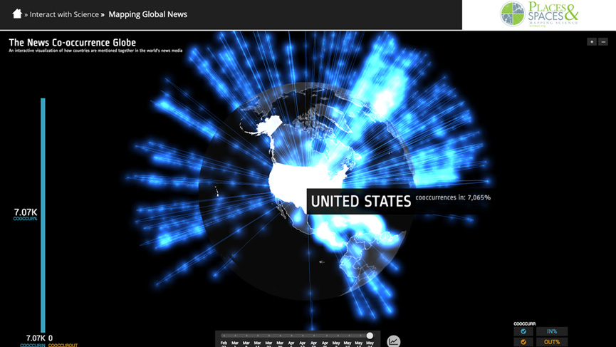
XI.3 Mapping Global News
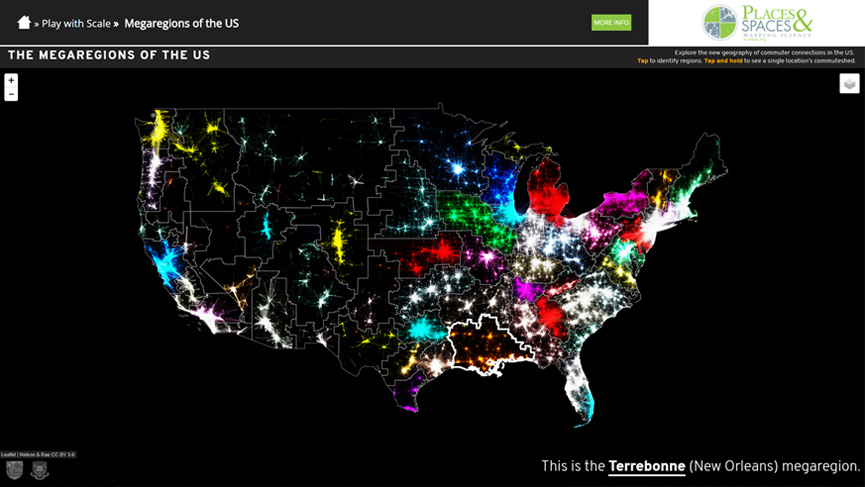
XIII.3 Megaregions of the US
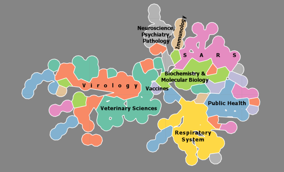
Coronavirus SoS
Data Science & Analytics Explorer
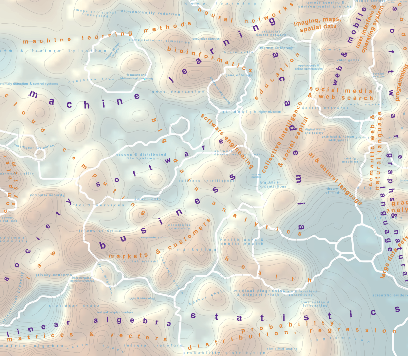
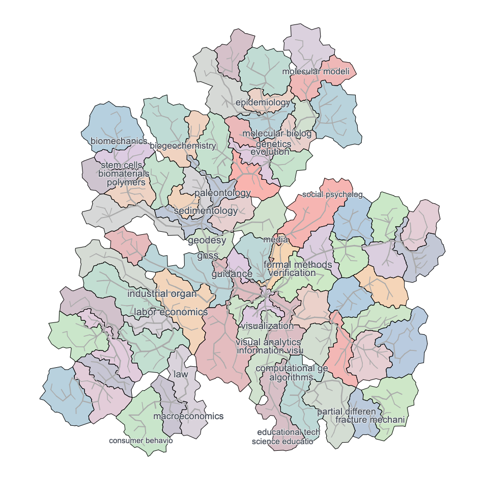
Multi-level Visualization of Google Research Topics

 <i>Click the image above to view interactive Macroscope.</i> <br><br>This macroscope was created by Kalev H. Leetaru, an expert on
      big data and global society. It uses as its source material, quite literally,
      the news of the world. The visualization explores how new stories group
      countries into distinct clusters, creating an inherent geographic network
      structure over the planet akin to “communities” as seen through the eyes of the
      world’s presses. In essence, for every monitored news article published anywhere
      in the world, it compiles a list of the other countries also mentioned in those
      articles.
      <br><br> <b>Authors</b>: Kalev Leetaru
      <br> <b>References</b><ul>
      <li>The GDELT Project. 2015. “Mapping Media Geographic Networks: The News Co-Occurrence Globe.” The GDELT Project Website. Last modified June 1, 2015. <a href='http://blog.gdeltproject.org/mapping-media-geographic-networks-the-news-co-occurrence-globe'>http://blog.gdeltproject.org/mapping-media-geographic-networks-the-news-co-occurrence-globe</a>.
        
      <br><li>The GDELT Project. 2016. The GDELT Project Homepage. Accessed January 10, 2016. <a href='http://www.gdeltproject.org'>http://www.gdeltproject.org</a>.

      <br><li>Leetaru, Kalev. 2015. Mapping Global Society. Courtesy of The GDELT Project. In “11th Iteration (2016): Macroscopes for Interacting with Science,”<i>Places & Spaces: Mapping Science</i>, edited by Katy Börner and Lisel Record.<a href='http://scimaps.org'>http://scimaps.org</a>.</ul>
<i>Click the image above to view interactive Macroscope.</i> <br><br>Every day, millions of Americans weave together a new geography
      of commuter patterns. These interlinked megaregions, connected by economic ties,
      suggest that new kinds of geographic categories are necessary if we wish to
      accurately describe the functional network of flows and relationships which
      shape our lives in the modern world.
      <br><br> <b>Authors</b>: Garrett Dash Nelson, Alasdair Rae
      <br><b>References</b><ul>
      <li>Nelson, Garrett D. and Alasdair Rae. 2016. “An Economic Geography of the United States: From Commutes to Megaregions.” <i>PLoS ONE</i> 11(11): e0166083. <a href='https://doi.org/10.1371/journal.pone.0166083'>https://doi.org/10.1371/journal.pone.0166083</a>.
      
     <br> <li>Nelson, Garrett Dash and Alasdair Rae. 2016. <i>Megaregions of the US.</i> Courtesy of Dartmouth College and the University of Sheffield. In “13th Iteration (2017): Macroscopes for Playing with Scale, <i>Places & Spaces: Mapping Science</i>, edited by Katy Börner and Lisel Record. <a href='http://scimaps.org'>http://scimaps.org</a>.</ul>
<i>Click the image above to view interactive Macroscope.</i> <br><br>Dealing with the ongoing human coronavirus pandemic is difficult, no matter which term you use: SARS-CoV-2, 2019-nCoV, or COVID-19. We have all learned that addressing a pandemic like this requires many people working together from different backgrounds and accustomed to speaking in the language of sometimes wildly different domains.

      In such a circumstance, how can one develop shared understanding? From urban planning to national defense, maps have long served precisely such a role, laying the foundation for exploration, learning and informed decision-making. Wouldn't it, therefore, be great if such a "map" existed for the coronavirus research domain? It should help in diverse scenarios, whenever it is important to cut through the multitude of opinions and overwhelming flood of information, whether you are designing educational activities, attempting to form multidisciplinary teams to address the current crisis, or communicating with diverse stakeholders.
      
      What is presented here is a knowledge map of coronavirus research. Based on an inventory of more than fifty years of research in this field, going back to the late 1960s, the map contains the main contributing research fields and scientific concepts in a compact visual form. It was created through a combination of scientometric network analysis and geographic information system (GIS) technology and is the basis for two products: (1) a guided tour of the diverse topics addressed by researchers and the methods they employ, presented in the form of a story map; (2) a dashboard app that links concepts encountered in the map to live Wikipedia entries and scientific publications.
      
      <br><br> <b>Authors</b>: André Skupin
      <br><b>References</b><ul>
  <li>Center for Information Convergence and Strategy (CICS). 2021. Home Page. Accessed March 22, 2021. <a href='https://cics.sdsu.edu/'>https://cics.sdsu.edu</a>.</ul>
<i>Click the image above to view interactive Macroscope.</i> <br><br>Welcome to the first comprehensive base map of Data Science & Analytics! Think of this as a topographic map of the world of big data, from foundational concepts to societal implications. It includes a GPS-like functionality for projecting any text query onto the map.

      We set out to make this complex domain more accessible to anyone. Whether one is a complete novice or a seasoned expert, chances are that there is something to learn from this detailed, multi-scale visualization. Whether it's "blockchain" or "agile development" or "copyright law," they're all there, in contexts and patterns derived from 100,000+ domain artifacts. If you've ever used an interactive map, you already know how to navigate this one: zooming and panning — that's it!
      
      Like in a geographic map, when zoomed out, one sees the main "countries" that make up Data Science & Analytics. Those top-level regions are labeled in purple and delineated with white borders. When zooming in, more detailed structures are revealed, first labeled in orange, then in blue and gray. Mountains indicate high topical focus and specificity, like the one labeled "cloud services - cloud infrastructure - virtualization." Valleys indicate more general, broad and mixed concepts, like "open access & online communities". Deeply cut valleys, especially when coinciding with a boundary demarcation, correspond to strong separation of neighboring mountain ranges.
      
      The Data Science & Analytics Explorer web app was developed by BigKnowledge, with support by the Business-Higher Education Forum (BHEF), an organization of Fortune 500 CEOs, university presidents, and other leaders dedicated to the creation of a highly skilled workforce.
      
      
      <br><br> <b>Authors</b>: André Skupin
      <br><b>References</b><ul>
  <li>BigKnowledge. 2020. “Data Science & Analytics. Mapped.” July 5, 2020. Accessed March 22, 2021. <a href='https://storymaps.arcgis.com/stories/0e8ae7ab747042598da6545f6bb1c98f'>https://storymaps.arcgis.com/stories/0e8ae7ab747042598da6545f6bb1c98f</a>. 

    <li>BigKnowledge. 2021. Home Page. Accessed March 22, 2021. <a href='https://bigknowledge.net/'>https://bigknowledge.net</a>. 
    
      <li>Open Geospatial Consortium. 2021. “Geospatial Technology Explorer.” Accessed March 22, 2021. <a href='https://www.ogc.org/techexplorer'>https://www.ogc.org/techexplorer</a>. </ul>
<i>Click the image above to view interactive Macroscope.</i> <br><br>We visualize a network of topics generated by extracting data from Google Scholar. The Google Topics graph is obtained from Google Scholar academic research profiles. On Google Scholar, researchers self-report the topics they work on, giving a natural way to find associated topics. We started with the top 1,000 universities as given by CWUR and extracted data for all corresponding researchers. After some data cleaning and processing (e.g., merging “algorithm” and “algorithms”), we obtained a topic graph with 34,774 nodes and 646,582 edges. The weight of each node is determined by the number of people who reported working on that topic.

      For this visualization, we consider a subgraph induced by the top 5,483 nodes and compute a hierarchy of trees that enables semantic zooming in the interactive visualization. In the bottom level, all nodes are shown, while higher levels show more popular topics. Each level in this hierarchy is represented by a tree, spanning the top-k nodes. The hierarchy is created with the help of a multi-level Steiner tree algorithm. The multi-level Steiner tree ensures that if a node or edge is present at a given level, it must also be present in every level below.
      
      The interactive visualization is constructed with the Zoomable Multi-Level Tree (ZMLT) approach. We assign different edge lengths to edges based on the level in which they first appear, with edges that appear in high levels having long lengths and edges that appear in lower levels having short lengths. The ZMLT approach lays out the multi-level tree while maintaining two guarantees (G1-G2) and optimizing two criteria (C1-C2):
      G1: no crossings: every tree in the hierarchy should be drawn without crossings
      G2: no overlaps: all nodes at given (and higher) level are labeled without overlaps
      C1: desired edge lengths: the algorithm aims to realize desired edge lengths
      C2: compactness: the algorithm aims to minimize the total drawing area
      
      Finally, we provide a map-like visualization of the hierarchy, by clustering related topics. This step uses the GMAP framework to define the cluster areas. We also provide several basic map features: semantic zooming (given by the defined layers), searching, mouse-over for more information, etc. We show both the map and the current level of the node-link diagram.


      <br><br> <b>Authors</b>: Kathryn Gray, Mingwei Li, Reyan Ahmed, Stephen Kobourov, Katy Börner
      <br><b>References</b><ul>
  <li>Ahmed, Reyan, Patrizio Angelini, Faryad Darabi Sahneh, Alon Efrat, David Glickenstein, Martin Gronemann, Niklas Heinsohn, Stephen G. Kobourov, Richard Spence, Joseph Watkins, and Alexander Wolff. 2019. <a href='https://dl.acm.org/doi/fullHtml/10.1145/3368621'>“Multi-level Steiner Trees.”</a> <i>ACM Journal of Experimental Algorithmics</i> 24 (2.5). 

    <li>Burd, Randy, Kimberly Andrews Espy, Md Iqbal Hossain, Stephen Kobourov, Nirav Merchant, and Helen Purchase. 2018. <a href='https://dl.acm.org/doi/10.1145/3206505.3206531'>“GRAM: Global Research Activity Map.”</a> In <i>Proceedings of the 2018 International Conference on Advanced Visual Interfaces</i>, 1–9.
    
      <li>Center for World University Rankings. 2021. Home Page. Accessed March 22, 2021. <a href='http://cwur.org'>http://cwur.org</a>. 
    
        <li>De Luca, Felice, Iqbal Hossain, Kathryn Gray, Stephen Kobourov, and Katy Börner. 2019. <a href='https://arxiv.org/abs/1906.05996'>“Multi-level Tree Based Approach for Interactive Graph Visualization with Semantic Zoom.”</a> <i>arXiv</i>, June 14, 2019. 
    
          <li>Gansner, Emden R., Yifan Hu, and Stephen Kobourov. 2010. <a href='https://ieeexplore.ieee.org/document/5429590/authors#authors'>“GMap: Visualizing Graphs and Clusters as Maps.”</a> In IEEE Pacific Visualisation Symposium, 201–208. Los Alamitos, CA: IEEE Computer Society. 
    
            <li>Gray, Kathryn, Mingwei Li, Reyan Ahmed, Stephen Kobourov, and Katy Börner. 2021. <a href='https://ryngray.github.io/ZMLT.pdf'>“Multi-level Tree-Based Approach for Interactive Graph Visualization.”</a> <i>EUROGRAPHICS 2021</i> 40 (3).</ul>